

 SA
SA  KW
KW  IE
IE AU
AU UAE
UAE UK
UK USA
USA  CA
CA DE
DE  QA
QA ZA
ZA  BH
BH NL
NL  MU
MU FR
FR 


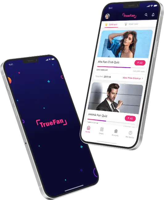
Every UI/UX designer looks forward to an efficient app design for their app or web product. This is one of the most prominent factors, helping users to stay glued to the platform. With this post, we are going to discuss how the hamburger menu is still a popular navigation option and some other alternative menu options.
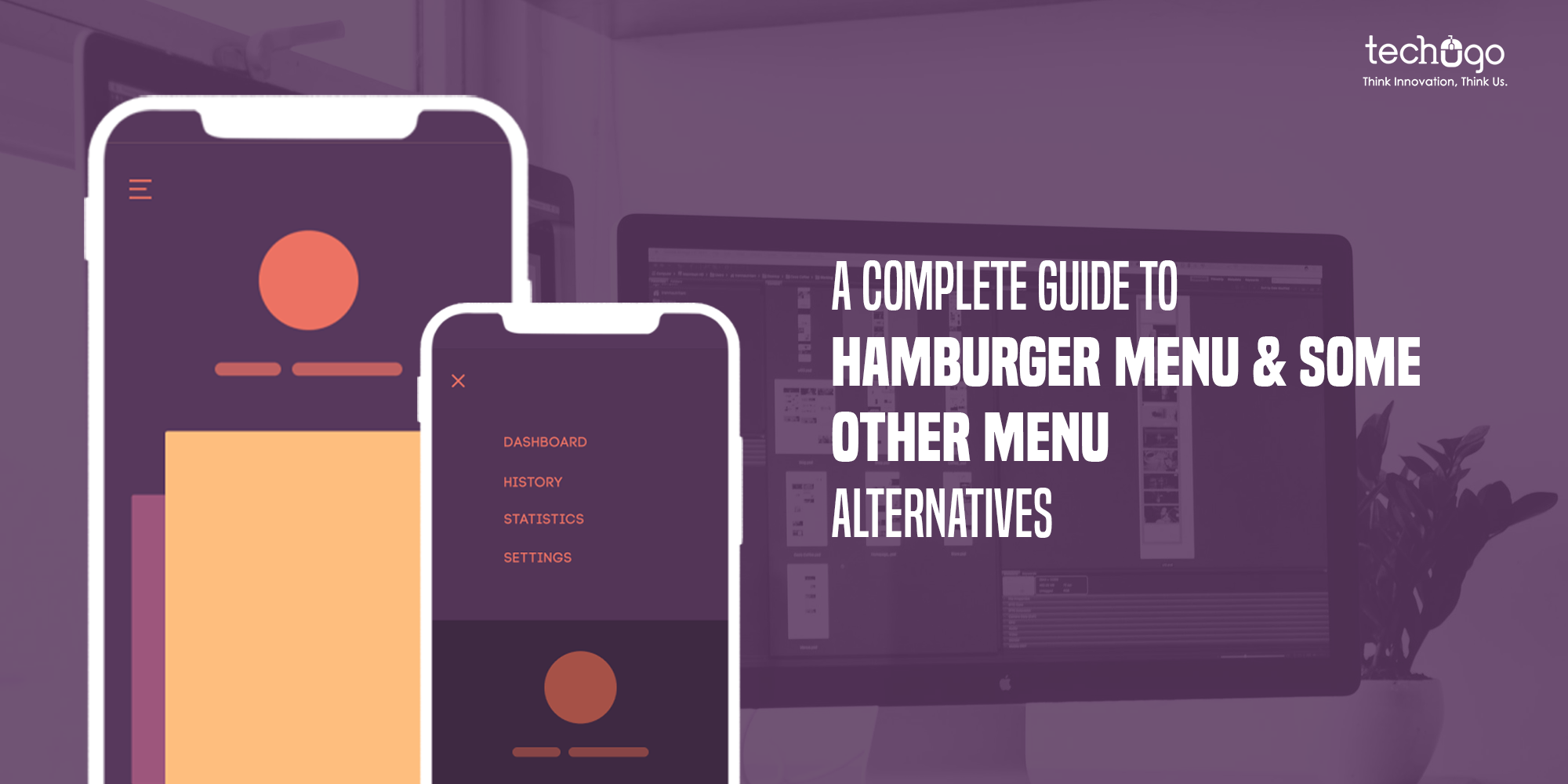
What is the hamburger menu?
Have you ever noticed those three horizontal lines on the top of the website or app? Yes, that is a hamburger menu, which collapses on clicking. The hamburger menu is without a doubt one of the most enduringly popular navigation bars. As it saves space, and provides a neat looking UX. That’s the reason it is designer’s and businesses’ favorite.
The hamburger menu found its existence in the design world, when in the ‘80s interaction designer Norm Cox designed it as part of the interface for the Xerox Star. However, this incredible navigation bar found its recognition in the year 2009, mobile apps became a household stuff, and people realized the worth of it. The very limited screen space it consumes on phone screens make this bar an engaging space-saving tool.
Let’s find out some more benefits it has got to offer…
Why the Hamburger menu is charming?
Well there are multiple reasons behind it, such as:
- It makes navigation a breeze
- Easy to be understood by everyone
- It boosts functionality to the next level
- Saves screen space, slowing designers to try other creativity
Now you must be wondering what are the alternatives to the Hamburger Menu?
You must know that user-experience is the key to the success of a mobile app, wherein every single usage on the app or website gets elevated further. If you think user experience is only about the features and functionalities then you are hugely mistaken, as design elevates every aspect to another level.
There are multiple options available in the design space to pick from, which can help the design world to experience the best of the strategies.
- Tab Bar Menu
- Full-Screen Navigation Menu
- Scrollable Navigation Menu
- Progressively Collapsing Menu
Tab Bar Menu
You should know that the tab bar is a navigation menu, that helps in organizing content or landing pages by tabs. Within the web design and apps, this menu option has become super popular. It allows visitors to see the navigation options right from the start. However, there are few guidelines to be followed for creating a Tab Bar menu…
- One of the options in the tab bar menu must be active;
- To stand out the active tab, include some contrasting color;
- Keep the first tab as the home page;
- There should be an order of the tabs;
- UI/UX designer needs to arrange tabs logically and related to the content;
- With every navigation option, use icons with labels.
Although, the tab bar menu is similar to the hamburger menu, in context of hiding content. But, with the tab bar menu, users get 4 or 5 visible top-priority navigation options on the screen all the time, that elevates the experience.
Full-screen navigation menu
A good question indeed! The full-screen pattern menu is solely devoted to the home page designed for navigation. Such a menu is hugely beneficial for unleashing in-depth information without disturbing the user experience. Within a full-screen navigation menu, to view other options, users need to tap or swipe while scrolling up or down. You should know that this type of menu is the perfect choice for the websites focusing on a task or direction.
Scrollable Navigation Menu
Are you catering to the long lists? Then the scrollable navigation menu is suitable for you. It allows your design to get different navigating options without creating a big distinction in priorities. If you are offering a service for the on-demand food delivery app, and willing to list the differences and larger list of restaurants, then a scrollable navigation menu will help you scale it further. It also allows your users to access the options to move from side-to-side. It goes without saying, but such a menu option is a perfect fit for the news, music, eCommerce, or restaurant categories. As it allows the users to explore more content with the scrollable navigation menu effortlessly and access services.
Progressively collapsing menu
Yes, this is another alternative to the hamburger menu, which is also referred to as the priority+ pattern menu. The reason it is picked by the UI/UX designer is due to the fact that it easily adapts to the screen width and allows users to view as much of the navigation as possible. It works just like the tab bar menu and lets the designers hide other tabs through a more button.
Food for thought
No wonder, we consume a product first from eyes, and this is where the role of efficient UI/UX strategy comes into the picture. And helps products get sold effortlessly, however, a minor mistake picked in this journey can spoil the complete plan. Therefore, you need to get an app project handled by the best UI/UX designer company – Techugo, and help your app grow immensely.
Our team is working relentlessly amid pandemic to help you get the incredible app solution with a sizzling UI/UX to captivate your end-users for longer.
Get in touch
We'd love to hear from you.


