 SA
SA  KW
KW  IE
IE AU
AU UAE
UAE UK
UK USA
USA  CA
CA DE
DE  QA
QA ZA
ZA  BH
BH NL
NL  MU
MU FR
FR 


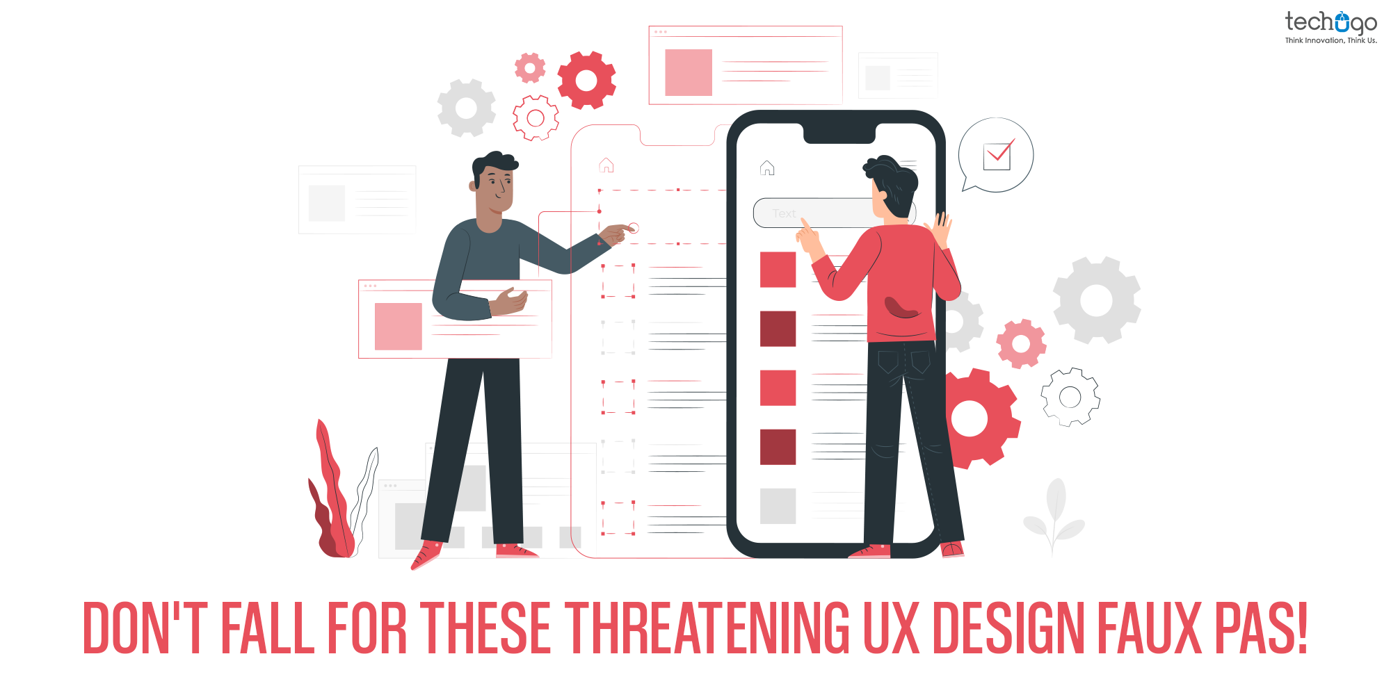
A successful app is not just about the features and functionalities, but you cannot miss the UI/UX factor as well. Being a UX designer your aim is to create engaging user experiences and drive visitors to turn into leads.
However, in this race, a focus only on aesthetics, take shortcuts, and end up relying on various common design patterns and trends can cost your app’s success.
If you think that users will figure out UX on their own by reading the instructions, then sorry but you are designing an app that is doomed to failure. Because the secret is NO ONE loves to read the instruction.
A good UX makes your app obvious, self-evident, and self-explanatory to use, with no tutorial or instruction crutch to rely on! A great UX design is all about making your users happy with the app. So it is very essential to give them every possible reason to get a curve line on their faces.
Let’s identify some UX mistakes that can obstruct their journey and make them grow closer to your competitors.
Poor Icon Design Choices That Reduce Usability
Icons are supposed to make life easier for users, not harder. In a perfect UX, an icon should communicate meaning instantly without needing a second thought, a tooltip, or an explanation. But when icon design goes wrong, it creates confusion instead of clarity
If a user has to pause and think, “What does this icon mean?”, the design has already failed its job.
Being creative and using something unique to give that OOMPH factor in the app design is not a bad choice. But your users need to understand what it means, and if they fail to comprehend then sorry to say, but your creativity is serving no purpose.
So, keep it simple, keep it familiar, and always design for instant understanding not decoration.
Lack of Responsiveness
Today, users don’t stick to just one device anymore. They switch between smartphones, tablets, and sometimes even desktops within the same journey.
App responsiveness is not a choice but a necessity! You need to ensure your app looks great no matter what gadget the audience uses. If the app is not responsive, it leaves an impression that the app isn’t functioning properly, and might be broken.
Another issue is ignoring touch behavior. Mobile users interact with fingers, not cursors. So spacing, button size, and gesture support become critical. If users accidentally tap the wrong element, it instantly creates frustration.
Hence, give them every element that works flawlessly on every device.
When Sign-Up Forms Become Too Lengthy
Think about it from a user’s perspective. They just discovered your app and are curious to explore it, but instead of getting started quickly, they are greeted with a long list of questions.
Yeah, you heard it right. The lengthiest forms to fill out the basic details of the users are painful. Users come to your app to access everything with instant access, and what you give them?
You welcome them with a set of unnecessary questions that really force them to abandon your app and uninstall it.
The truth is, users don’t want to “fill a form.” They want to access value as quickly as possible so make the form fast and simple
When Product Decisions Ignore Real User Needs
Don’t play over smart, there are chances you can go wrong. It is a good decision to bring something original and creative, but here you don’t need to turn into a self-centered cow, and become obsessed with your model. And ignoring users in the process.
Wake up!
Your app is made for the users, so it must have the flavor of their expectations. Failing to give attention to it is where the actual problem starts.
You need to merge the two sides, where one speaks of users’ expectations and the other side brings your creativity into real practice.
Filling app space with EXTRA content
It is very obvious for the users to avoid the excessive content written on the app screens, to jump to the rea feature. In this run, you are likely to make them miss the relevant information. Your users are in hurry, and you are dealing with people who have ample opportunities in the market available. Hence you need to be extra careful while putting every piece of information on your app.
Keep the content CRISP that matches with your interactive design.
Overloading UX With Unnecessary Visual Elements
Ever heard of overemphasizing in an app?
It happens quite a lot when you misunderstand engagement with app aesthetics only. I agree, aesthetics are important, but your entire focus need not go on it. You need not get carried away by too many images, an extra dose of animation and music. Here, you need to engage users to relish the app, not interrupt their experience.
Keep them minimal and don’t let them fiddle with your users’ experience journey.
Broken Navigation Paths
You must have got what I meant from the title. Yeah, you got it right, am referring to poor app navigation, leading customers to travel from one feature to another in the app, and still fail to provide the required information.
Remember, navigation is one of the most vital parts of your app, that drives your customers to the goal of the app, so make it simple and easy.
Flood of pop-ups
Gimme a BREAK!
Your marketing team must have instructed you to give pop-ups to drive conversion, but you need to hold the horse. Sometimes too many pop-ups blur down the real value of your products and services, and it sounds nothing but salesy and gives the audience that you are not a reliable product, as you are pushing hard to SELL.
Chuck it away and make pop-ups lesser and not sounding absurd within your app.
Moral Learned!
The secret sauce to building an intuitive user experience is a well-thought approach given while designing an app. Here your users and their expectations should be your prime focus, helping you to create UX that is a perfect blend of creativity and your users’ mental model.
Invest your energy in crafting an app product that is easier to use. Your users shouldn’t have to depend on an instruction crutch to operate the app.
There are many other mistakes that can ruin your project, this is where the Techugo team steps in and ensures to offer an impeccable product for your audience to enjoy.
How about discussing your next project with us?
We would love to know more about your project and shape it with our expertise.
Give us a call for a no-obligation quote today!
FAQ
1. What are common UX design mistakes in mobile apps?
Poor navigation, cluttered screens, long forms, non-responsive layouts, excessive pop-ups, and unclear icons frustrate users and cut engagement. Techugo, a top mobile app development company, avoids these in UI UX design for intuitive app design.
2. Why is UX design important for mobile apps?
It drives satisfaction, retention, and conversions by making apps easy and intuitive. Techugo’s app design reduces drop-offs through seamless UI UX.
3. How does bad UX affect app performance?
Leads to high uninstalls, low ratings, less engagement, and revenue loss. Techugo counters with optimized UI UX design.
4. What makes a mobile app UX design successful?
Consistency, thumb-friendly layouts, clear gestures, fast loads, and user testing. Techugo excels in these for superior app design.
5. Why do users abandon mobile apps quickly?
Slow speed, intrusive ads, privacy issues, bugs, and complexity. Techugo’s UI UX design prevents this via polished flows.
6. How do you improve user experience in an app?
Simplify interfaces, A/B test, track metrics, optimize speed, add offline support. Techugo uses AI for iterative app design improvements
Get in touch
We'd love to hear from you.