 SA
SA  KW
KW  IE
IE AU
AU UAE
UAE UK
UK USA
USA  CA
CA DE
DE  QA
QA ZA
ZA  BH
BH NL
NL  MU
MU FR
FR [ LET’S TALK AI ]
X
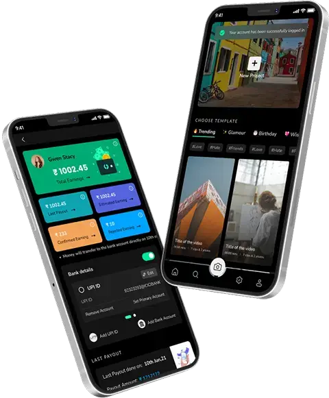
Discover AI-
Powered Solutions
Get ready to explore cutting-edge AI technologies that can transform your workflow!


Get ready to explore cutting-edge AI technologies that can transform your workflow!


Facebook’s website redesign is beginning the rollout with a new Dark Mode!
Yes, you heard me correct, Facebook has begun sharing the access to its redesigned desktop experience. This design theme was much-discussed during April’19.
The new UI is supposed to be least cluttered with much brighter icons. But hey wait, wasn’t this supposed to get launched somewhere around Spring?
Well, to pace up with the surprise bandwagon, Facebook is rolling it out!
Who All Can Access It?
Well, in that case, you need to keep your hopes low, since Facebook is launching the NEW UI with a “small percentage” of people.
Such lucky chaps, are prompted with a pop-up inviting them to help test “The New Facebook.” On clicking, Facebook would drive them to an option where they can set the website to use white backgrounds and bright colors, or a dark-mode background similar to the popular features offered on computers, iPhones and devices powered by Google’s Android software.
Hmm, amidst the speculations, we at Techugo are bringing the first outlook and comprehensive comparison of Facebook’s old vs new UI game.
HOME/FEEDS REVAMPED
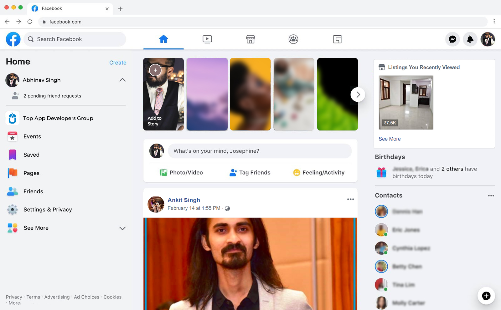
The design features rounded corners, and it goes without saying but it is much vibrant and appealing than its current theme.
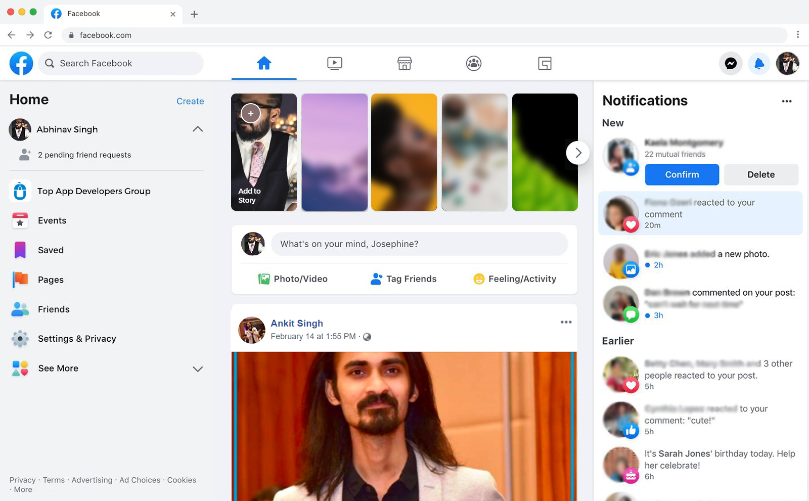
NOTIFICATIONS ARE MORE ENGAGING
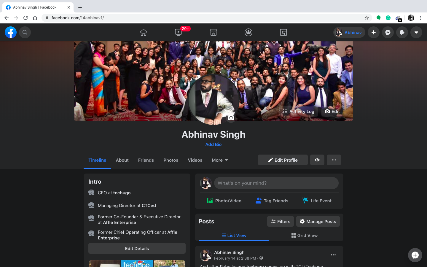
PROFILE PAGE IS NEAT, MODERN AND ELEGANT
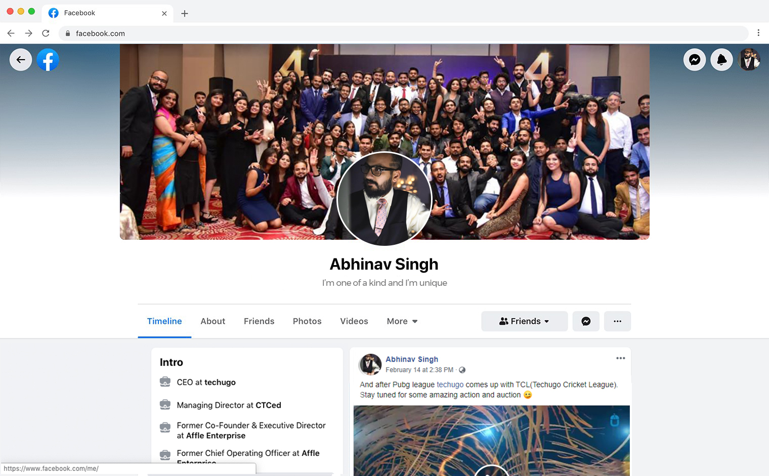
What’s Our Take?
Well, like any other creative approach, this new design isn’t universally liked, and still has few technical hiccups with text readability in a few dark mode screens.
But that’s not the end of the world, and certainly, there are going to be much better and engaging improvements in the near future.
Don’t forget to like, share and spam this post with your love!
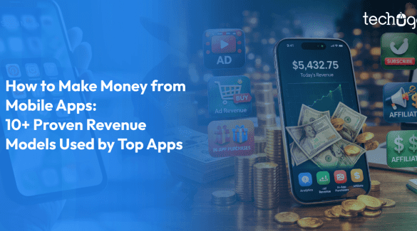
Millions of people open mobile apps every day without thinking about what it actually takes to make those apps work. They scroll, swipe, watch videos,..
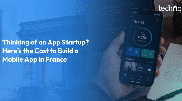
When someone decides to build an app in France the question everybody asks is never related to design, user experience, or the functionality of the ap..

Write Us
sales@techugo.comOr fill this form