 SA
SA  KW
KW  IE
IE AU
AU UAE
UAE UK
UK USA
USA  CA
CA DE
DE  QA
QA ZA
ZA  BH
BH NL
NL  MU
MU FR
FR 


Colors, always play an integral part in each of our life and for a graphic designer, it solely, means to play colors at every inch of job. I read somewhere, color is the basic element of the visual communication. And I think somehow color reflects and affects our mood too. If I talk about on a general pattern, the different shades of colors from the pallets thrown by nature diversify each moment of our life.
To talk about my personal experience, a bluish sky with cute rainbow causes happiness filled with excitement within me to rush myself to terrace and indulge into kite flying session. On the contrary, an autumn’s day, a dark and gray sky gives a horror within me, and make me switch on my room’s light even in the full broader daylight. Albeit, I was taught by my teachers, family and books also that each color has its separate meaning that represents the language of them.
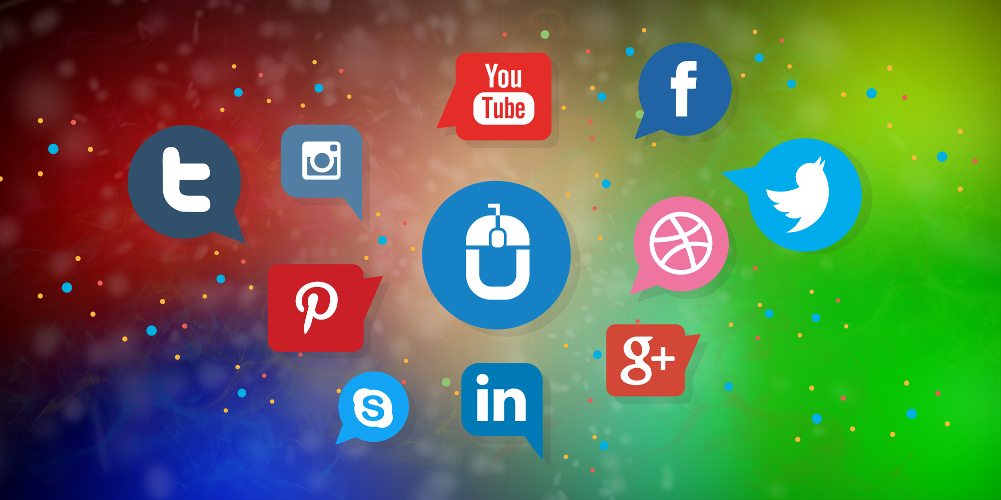
While designing many of the apps, I have noticed that Twitter, Facebook, LinkedIn, Skype and the company am associated with – Techugo, also, have used various shades of blue as their branding color. Is this merely a coincidence, or a pre-planned calculated marketing tool? I got confused and decided to dig in further within Google search, what I found was really impressive and logical. Blue color has been considered with positive qualities such as trust, integrity and efficiency. This color conveys the communication, logic and a connection between the content and the on looker. That’s the reason a color which translates the best adjectives such as: calm, reflection and serenity within it, it becomes noteworthy for the brands to choose it.
So, basically the social media platforms play with the psychology of color with calming qualities that social media apps want to align their brand identity with. On the technical front, blue contrasts nicely with text, and it gets easier to spot the word and it doesn’t take over the screen. Just to exemplify: a yellow or red twitter logo color would not make the tabs more visible and clear to the users, in the same way yellow would be too light to notice on a light background, and a purple would be too close to the color of the text to make it prominent.
In a nutshell, it’s thoroughly fascinating that simply changing something as small as color can completely change the outcome of something and can help a company to turn into a brand. Whether it is dark, light or any other shade of Blue, at the end it relates to the mind and affect us emotionally.
ANKIT MALHOTRA
Get in touch
We'd love to hear from you.